Colors, Fonts, and Imagery
The third and final topic in our series is discussing how to choose color, font, and imagery for your branding. It may not seem like a big deal, but these ingredients can make a mark on recognition and showcase your brand to your customers.
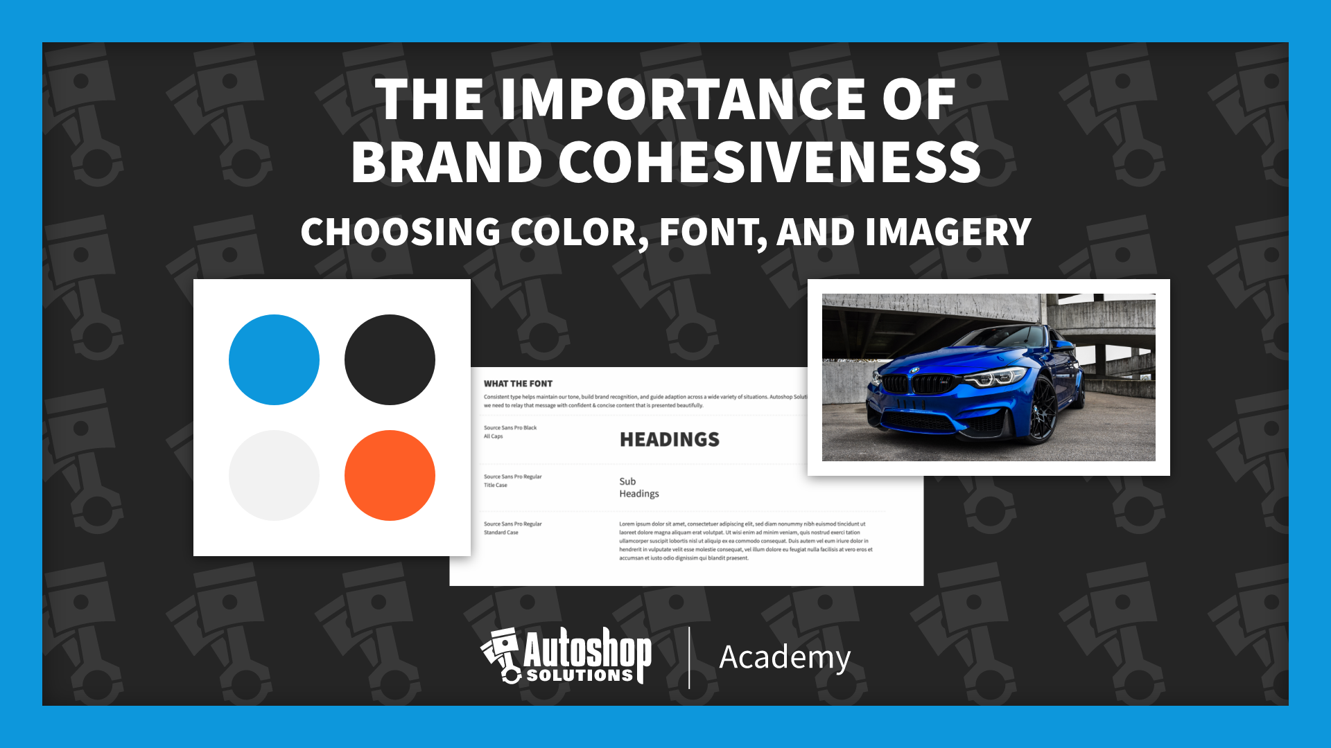
Last time we discussed how an eye-catching LOGO could capture the essence of your brand and company. Today, we will go a step further and talk about three key components.
- A COLOR scheme that pairs with your company’s personality
- A FONT that represents the tone and voice of your shop
- And how using IMAGERY can complement the whole process to reinforce your shop’s image
Choosing and Limiting Colors
When choosing color values, they should match the company’s tone and intended audience. Most often, less is more. It can get confusing with too many values as your team might not know which color to use for instance and your audience can only associate so many hues to your brand. It’s important that the brand and logo colors align and will work together. Consider how it will look when showcased on your signage, uniforms, web, and print materials.
Selecting and Using a Font
Consistency is key when establishing a font for your brand and is especially relevant if you decide to expand. You want to uphold your company’s tone and image through all channels of communication and growth. It may seem like a small detail, but it helps to have them ironed out as your company grows.
Here’s a quick example showing how you could set it up for consistency at your shop:
- Always use “SAMPLE” font
- When laying materials Headings should always be uppercase
- Body text should be in sentence case
- All text should be “SAMPLE” color value when used over a light background or “AN AGREED UPON VALUE” when used over a dark one
Using Your Imagery
Photos are a huge part of any business. People want to see visuals and examples of your work and what your shop looks like inside. Anyone can use stock photos, but we recommend taking your own photos. You may not be a professional photographer, but taking images with your iPhone guarantees they are unique. It separates you from your competitors and eliminates the chance that your competitors will have the same stock photos on their website.
As a shop owner, it’s essential to think about your shop’s branding and the part it plays in running a successful business. Spend your marketing dollars on what’s necessary and get a professional logo made. Ultimately, it will save you time and money as you continue to grow toward your end goals. When establishing your brand, think it over, and don’t cut corners. It’s what shapes your business and will always be a model of who you are.
Autoshop Solutions is an automotive marketing agency that specializes in websites and digital marketing solutions. Want to learn more about our services? Or watch this blog in action. Please visit autoshopsolutions.com/academy or subscribe to our YouTube channel.

Autoshop Solutions